


In this post I want to show you how to energize our content using a Headless CMS like Storyblok.
Prerequisites
As this post is the continuation of a series, if you haven't read it yet you should take a look at Part 1 and Part 2 before starting.
Also, If you already have an account at Storyblok, log in, and if not register to start.
Now we're ready to follow!
Maybe you're wondering why I didn't add Storyblok in the first place. Because now I can show you how easy it can be to adapt your project to this CMS, just like I did with my personal website.
If you want to see how to add it from scratch, I recommend you to read Add a headless CMS to Nuxtjs
Step 1. Create a Storyblok space
It's as simple as pressing the button Create new space at the sidebar and add on the input field the name we have chosen for our web app:

Once you have created it, you will see a page called home with sample content. It's time to let our project connect with this data!
Step 2. Connect to the Storyblok API
The fascinating thing about all this, is that they already give us everything ready. If you use any modern technology other than NuxtJS, you will have a Storyblok client ready, and for Nuxt it’s as simple as add their module, we just have to install it,
npm install storyblok-nuxt --save
and configure the module in nuxt.config.js with the accessToken, found in Settings > API-Keys in the panel. Just add:
modules: [
    ['storyblok-nuxt', {
      accessToken: 'YOUR_ACCESS_TOKEN',
      cacheProvider: 'memory'
    }]
]
Now we can make requests to our content through this.$storyapi 🎉
Step 3. Making our content dynamic
Let's start at the beginning.
So far we have created the page with the style guide, but also, we have a home page and at some point we will want to extend the number of pages. So we're going to create a dynamic path for our pages.
In NuxtJS it's as simple as naming our file with a slash and the field that will generate that path, in this case _slug.vue.
We added in _slug.vue the following template:
<template>
  <div>
    <header>
      <h1>{{ story.name }}</h1>
    </header>
  </div>
</template>
and the script with the API call from the asyncData method:
<script>
export default {
  asyncData(context) {
    // home slug content by default
    const slug = context.params.slug ? context.params.slug : 'home'

    // Load the JSON from the API
    return context.app.$storyapi
      .get(`cdn/stories/${slug}`, {
        version:
          context.query._storyblok || context.isDev ? 'draft' : 'published'
      })
      .then((res) => {
        return res.data
      })
      .catch((res) => {
        context.error({
          statusCode: res.response.status,
          message: res.response.data
        })
      })
  },
  data() {
    return { story: { content: {} } }
  }
}
</script>
Changing the name of our Home page in the Storyblok panel, by Cabbage we see the same result as our previous index.vue, we can now remove it.

To see the result in the Storyblok panel preview we must add our local route, in my case localhost:3000, go to Settings > General and add it in Location (default environment).
Add dynamic components
In order to represent the blocks and content types that the Storyblok API will return, we must use the dynamic components of VueJS.
So let’s add in our template _slug.vue the following code:
<template>
  <div>
    <header>
      <h1>{{ story.name }}</h1>
    </header>
    <!-- Component: Content Type -->
    <component
      :is="story.content.component"
      v-if="story.content.component"
      :key="story.content._uid"
      :blok="story.content"
    ></component>
  </div>
</template>
Now we simply have to globally create the components that we'll define in our Storyblok space. For now, we only have one Content Type called page, let's see how we'll do it!
First, we will create a plugin to add the new components, in the plugins folder add the file components.js with the content below,
import Vue from 'vue'
import Page from '@/components/Page.vue'

Vue.component('page', Page)
and now, call it in the nuxt.config.js as:
plugins: ['~/plugins/components.js']
Then, we can create our first Content Type in the components folder as Page.vue, we'll have another dynamic component that will represent the blocks we add in the body field (blok.body):
<template>
  <div>
    <component
      :is="blok.component"
      v-for="blok in blok.body"
      :key="blok._uid"
      :blok="blok"
    ></component>
  </div>
</template>

<script>
export default {
  props: ['blok']
}
</script>
Make the Styleguide page dynamic
We will add a new Entry, a new page, to our Storyblok panel with the following name and slug:

Now go to the Components option in the panel's sidebar and delete all the default components except the Content Type Page.
Let's create our own!
Click on New and choose the option Nestable, add the name of the component with lowercase and dashes.

Define the schema with the fields you will need on this component and choose their type.
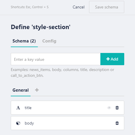
Then, create your own Vue component to represent this component, or reuse one you have already created as I did.
First, I have in StyleSection.vue:
  <template>
    <div class="pt-8">
      <header class="pb-6">
        <h3 class="capitalize">
          <slot name="title"></slot>
        </h3>
        <p class="pb-2 border-b border-gray-300 text-gray-700">
          <slot name="title"></slot> for app theme.
        </p>
      </header>
      <slot />
    </div>
  </template>
Now I change the slots by the blok content that comes in props:
  <template>
    <div class="pt-8">
      <header class="pb-6">
        <h3 class="capitalize">
          {{ blok.title }}
        </h3>
        <p class="pb-2 border-b border-gray-300 text-gray-700">
          {{ blok.title }} for app theme.
        </p>
      </header>
      <component
        :is="blok.component"
        v-for="blok in blok.body"
        :key="blok._uid"
        :blok="blok"
      ></component>
    </div>
  </template>
Once I’d updated the component I added it to the component.js file as:
  ...
  import StyleSection from '@/components/StyleSection.vue'

  ...
  Vue.component('style-section', StyleSection)
Use it on your page pressing Add block button and selecting your new component:

Now it would be time to do the same with the components we have left: Colors, Gradients, Fonts and Icons.
We can choose to dynamize the whole content, adding all the fields that we want to represent in each component or, as it is my case, create a Nestable component without schema and simply add the component in StyleSection Add block.
Why have I done this? Because as it is a style guide its content will be static and, besides, it uses the TailwindCSS classes which, being in the .vue file itself, PurgeCSS does not remove them from our CSS file.
Then we will have something like this in our panel:

And the equivalent in our components.js file:
import Vue from 'vue'
import Page from '@/components/Page.vue'
import StyleSection from '@/components/StyleSection.vue'

/* Styleguide components */
import Colors from '@/components/styleguide/Colors.vue'
import Gradients from '@/components/styleguide/Gradients.vue'
import Fonts from '@/components/styleguide/Fonts.vue'
import Icons from '@/components/styleguide/Icons.vue'

Vue.component('page', Page)
Vue.component('style-section', StyleSection)

/* Styleguide components */
Vue.component('colors', Colors)
Vue.component('gradients', Gradients)
Vue.component('fonts', Fonts)
Vue.component('icons', Icons)
What's great? From now on, everything we create can have its storage place and we can edit and duplicate it easily!
In the following articles we will see the creation of charts for the dashboard bringing them to life with TailwindCSS and we will continue to energize it with Storyblok 😍
I hope Storyblok makes your life as easy as it is for me 💞
As always, I leave the repository here in case you want to take a look to progress: https://github.com/Dawntraoz/cabbage