A content creator using Figma
In this post, I want to tell you about my experience as a content creator using Figma. From the design of social media assets to a business card.
Previous article
A Front-end Developer using Figma
In it, I told about the basic concepts of Figma and my first experience with the tool. How I defined the design system for my website, what resources I used to define it, and how I created my first slides with the components of my design system.
If you are interested in reading it, here is the link: A front end developer using Figma.
Now we can start seeing how I have used Figma to create and share online content. Let's start!
Using Figma for social media
When you create tech content, you don't always start with a marketing background, which isn't necessary either. In my case, and I understand that could be the case of many content creators, I started creating articles because I wanted to have my own summaries of code and techniques that I had struggled with.
The reason for publishing it simply came about when I thought about making it public so that more people could find answers to their problems. And that's how the motivation to create my own blog and to make it evolve, little by little, started 🚀.
1. Social sharing card images.
The first thing I started designing to share online were the social media cards for every major page of my site: Home page, Projects, Talks & podcasts and Technical articles (my blog).
The image below is the card created to share my blog's URL.

To begin, I looked for the recommended frame size for images that are displayed when sharing a website on social networks, also known as Open Graph images, which was 1200×630. Then, I chose the equivalent frame in Figma called Facebook post.
Recommendation: Use images that are at least 1200×630 for the best display on high resolution devices.
With the frame picked, I started to build the base of all the cards and reuse the components of my design system.
First the top part, adding the logo and the URL of my website. Then I added the section with the main content using the heading component, some texts, and the logos of my titles.
And finally, at the bottom of the card, I used the label component to add my nick in any social network and the group of networks' logos I have under that nickname.
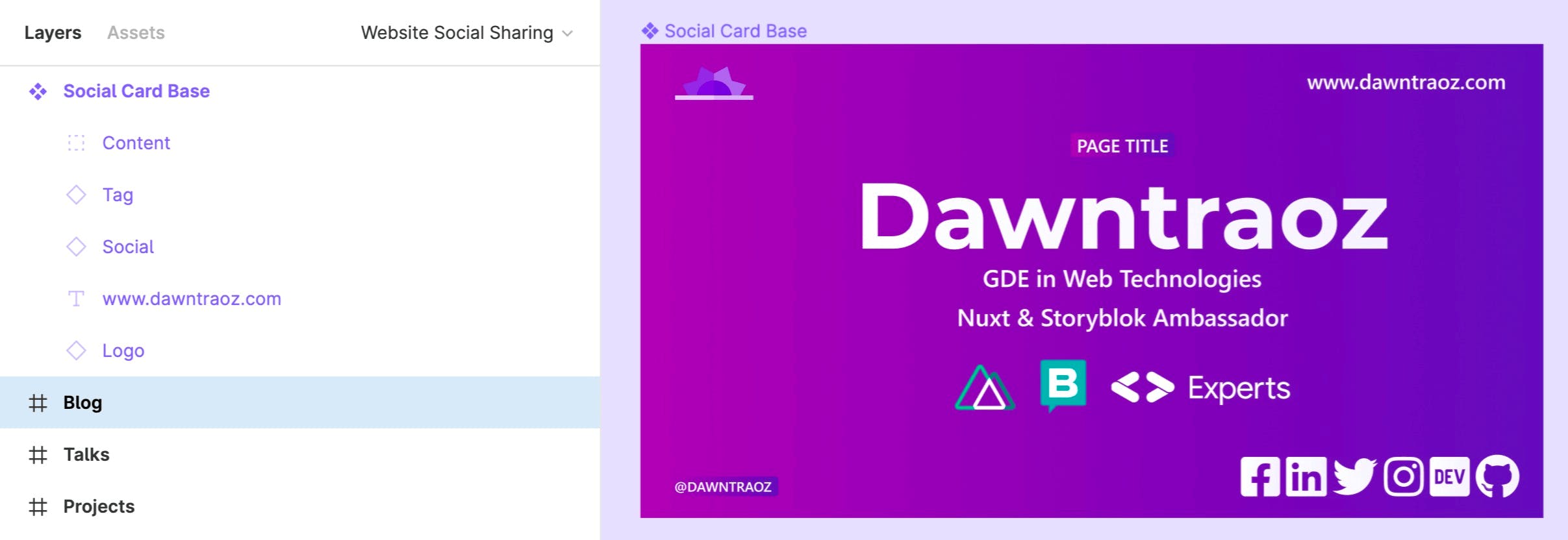
The purpose of these cards was to make the content of the page more eye-catching when sharing it online. The image below represents what it would look like if you share it on any social network, or messaging platform such as Telegram, Discord, Slack, …

2. Social banners.
When I started sharing the cards, I realized that they had nothing to do with the way I presented myself on my social media or professional platforms.
For that, I decided to take the same idea and implement it in banners for LinkedIn, Twitter, GitHub and Polywork. To do so, I simply reused the card but in different frame types, using Twitter Header for Twitter & GitHub, LinkedIn cover for LinkedIn & Polywork.
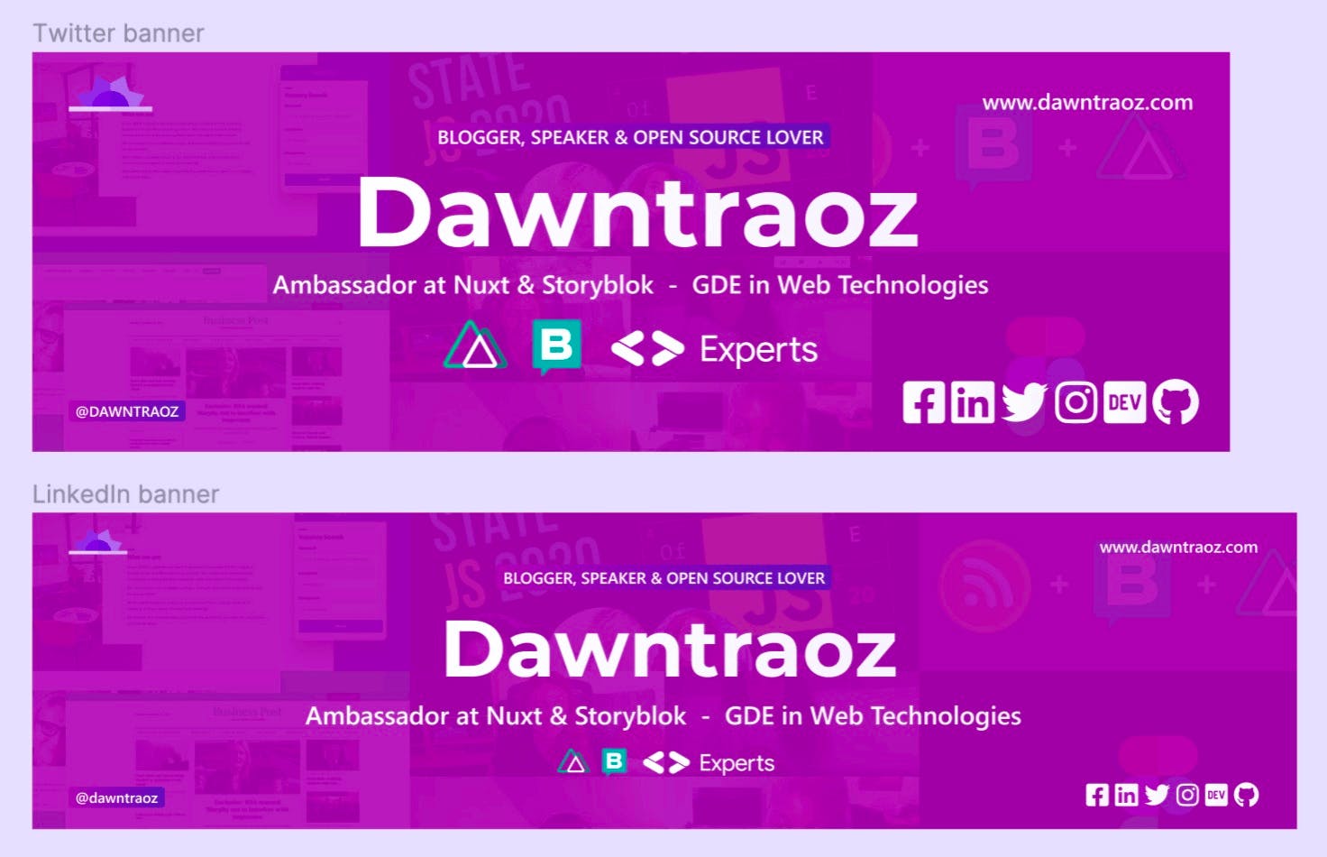
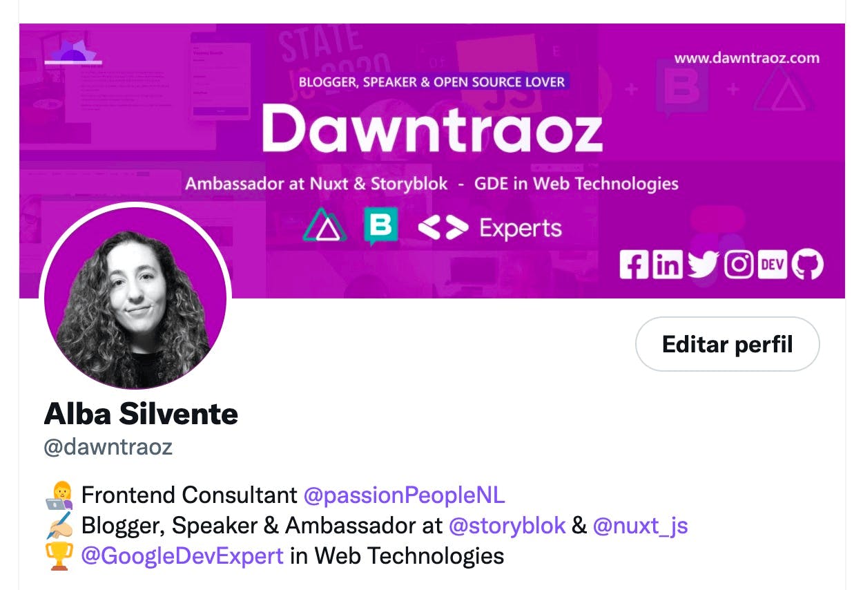
In this way, there is a match between the branding of my website and my socials. As you can see below, the banner on my Twitter profile looks like:
3. Instagram's artworks.
Once I got the hang of social media, I decided to start an Instagram account. A new format, totally different to how I used to share on Twitter, but I wanted to try it out and exploit my Figma design system a bit more.
Post.
My idea was to make small summaries of the articles already written on my blog and link to them. To do this, I decided to create Instagram posts with multiple images, and have the possibility to add up to 10 “slides”.
Each summary consists of a cover page, a brief description of the content with use cases, and a back cover with links to the article on the 3 platforms where it is published.

The image above shows an example summary for the article Alignment with Flexbox.
To keep the images of a single summary grouped together, I have defined an Auto Layout in horizontal mode with 120px of padding and 120px of spacing between items. And to define the size of the images to be posted on Instagram, each of the frames within this Auto Layout uses the Instagram Post frame (1080×1080).
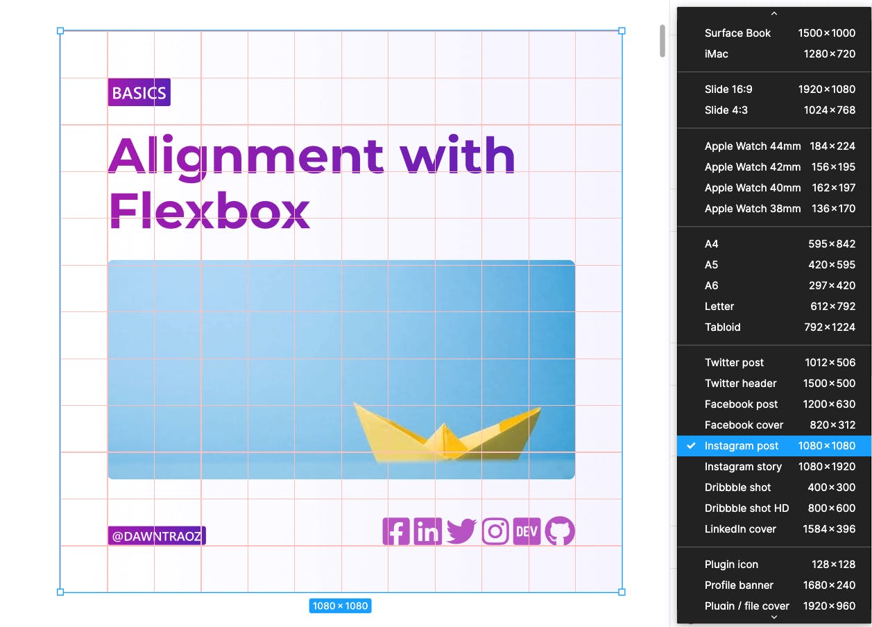
Once the frames were created, to position the content within them optimally, I defined a 90px size grid called Instagram Grid and saved it in the Grid styles to reuse it in future posts.
Then I simply started adding the components that already existed in my design system and let my imagination run wild.
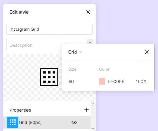
And finally, when I have finished creating the post, I select all the slides and export them in PNG format.
To see the possibilities of exporting, you can follow this guide to exports in Figma.
Grid composition (3 posts in 1 frame).
After uploading my first three summaries, I felt like giving a different format to the next one. It crossed my mind to define an image that would occupy the 3 squares of the Instagram grid. I had seen many people do this kind of composition before, and I wanted to create one of my own.
For this, I reused the previous Auto Layout and instead of adding 3 frames of 1080×1080, I added a frame of (1080×3)×1080. This way I was able to build it all together from the beginning and then cut it into the parts that compose it.
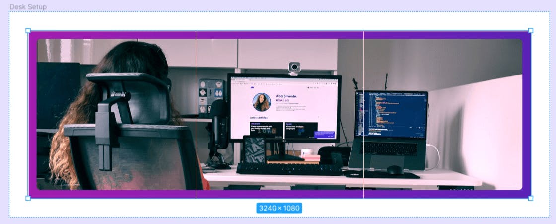
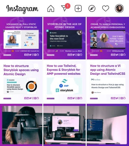
And after a few summaries and compositions, this is how my account's wall at @dawntraoz.tech looks like:
Highlights.
As a bonus, when promoting the posts via Stories, I decided to store these Stories in Highlights and create icons in Figma to make them catchy.

For icons, I always use the iconic.app library because I find them simple and ideal for any use case. Go and have a look for yourself 🚀
Using Figma for online courses and workshops
In the previous section, I showed you the designs I created for personal use. In this section, however, although there is not much difference in the use of Figma, the designs will be for external projects that have wanted to count on me as a content creator.
1. Focus on Storyblok lessons.
Recently, I taught 3 lessons of the Focus on Storyblok course at Headless Creator. And although they always take care of saving and publishing the videos of the lessons, I took care of the documentation.
To show the documentation to the students I created an open-source project published on a subdomain of my website, focus-on-storyblok.dawntraoz.com, and for each lesson I decided to create an Open Graph image.

Now, whenever I share any of the lessons on social media, you can see what it's all about at a glance!
2. “How to migrate from WP to a Headless CMS” workshop.
I recently gave a workshop based on the article How To Migrate From WordPress To A Headless CMS, which I published in July 2021 at Smashing Magazine. To make the content of the workshop, I came up with the idea of creating slides that represented the two brands, my personal brand and the Smashing Magazine one.
Combining my components with my colors and theirs, my typography with their logo and the inclination of the square shapes with the angle used in their logo, I got the format I wanted!
What do you think, do you think it looks good?

Referring again to my first article on Figma, to export the slides in an interactive format, I made use of the Pitchdeck Presentation Studio plugin.
Using Figma for articles artworks
One of the things that excites me most about Figma is that, one minute you're creating an article about it, and the next minute you're using it to create the artwork for that article.
You know the phrase 'All roads lead to Rome', well in this case 'All creations lead to Figma'.
A proof of this, is the artworks in the article Positioning elements with grid on my personal blog. They were all created in Figma, and one example of this is the image below:

Using Figma for selling a Notion Template
This use case is a bit different from the rest, because it doesn't talk about content creation, but about product design. Just sometimes it goes hand in hand if you want to monetize what you do.
One day, after seeing a couple of friends launch their first products, I decided to create my own, just to try it out. That's how I started to package the pages and templates I created for personal use in my Notion space, and begun the selling process.
Although it was a whole new world for me, I managed to find this video on how to sell Notion templates which gave me some useful tips and platforms, such as Gumroad, where I now sell my product.
Publishing on Gumroad requires creating exemplary cover images of the product's content and a good description of what it includes. To help you with this, Gumroad has a help section where they give you all the tips you need to produce a good product.
And, of course, I decided to use Figma to bring those covers to life. Which, according to Gumroad, had to be in two specific formats: 1280×720 and 600x600.
You can see the specification in this guide: Adding a Cover Image.
And that's what I did, I created 2 frames of those sizes and I tried combinations until I found the definitive covers:
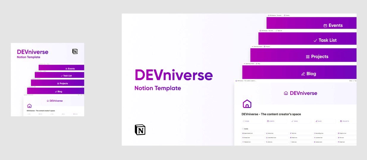
These are the covers of the Notion template DEVniverse.
Using Figma to create a business card (physically printed)
And last, but not least, as the face-to-face events were starting to come alive again, I really wanted to design my own business card, and that's what I did 🙈
The first thing I did was to look for a printing company near me and follow a guide with formatting tips. I found one with a guide on How do you design a business card?, and from it, I extracted the aspect ratio of my business card: ~1.5 (650×428).
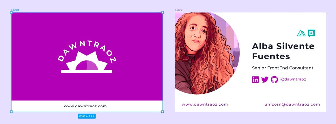
Something to keep in mind when selecting our brand colors:
As the color gamut of the RGB system is larger than that of CMYK, some RGB colors cannot be reproduced in CMYK. Therefore, if you send a file in RGB format for printing, it will not come out as expected.
In my case, the printed result was as in the image below, with a glossy finish on the front and a matte paper on the back, so people can write any necessary notes with a pen.
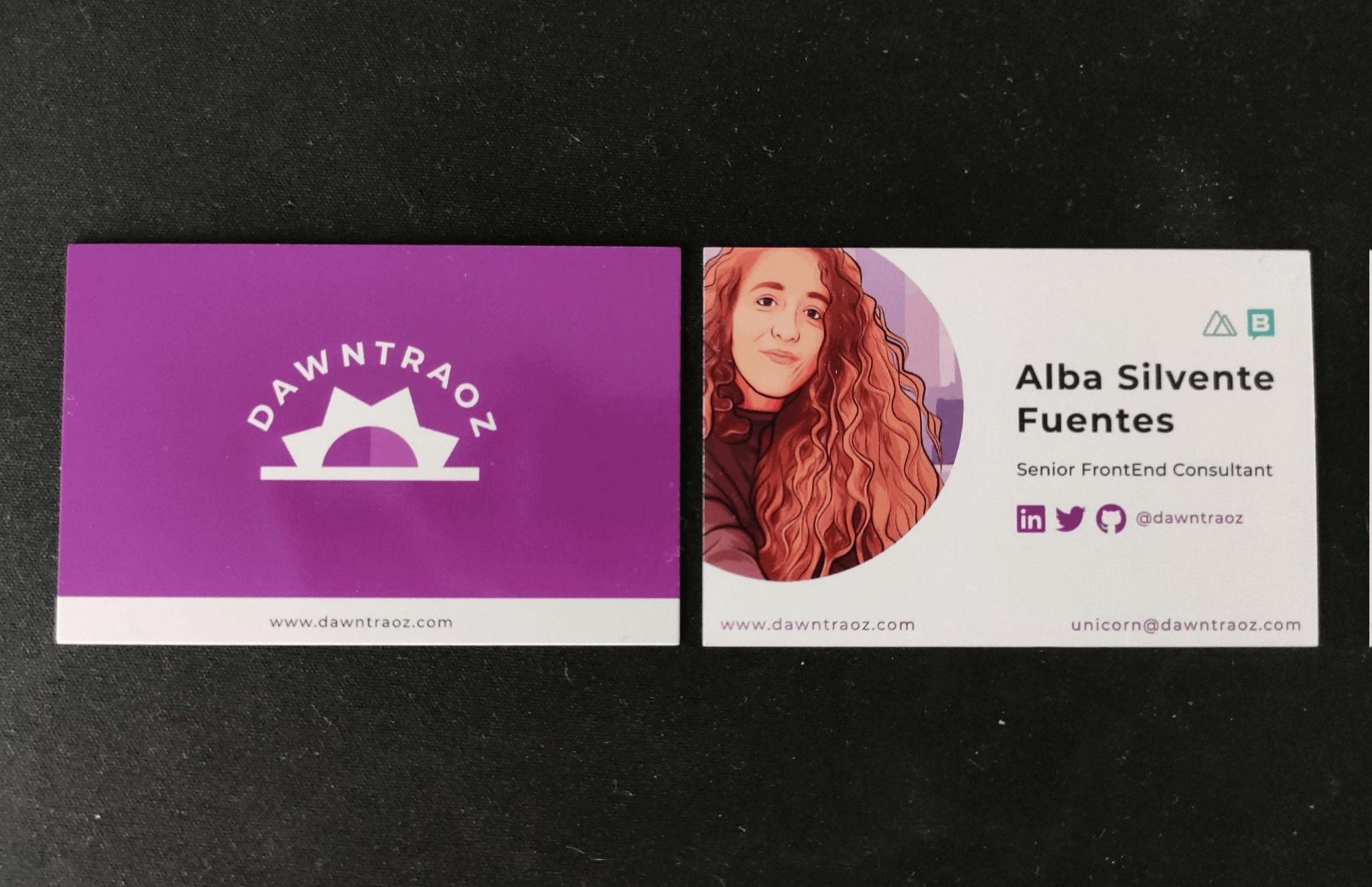
And these are all the fantasies I wanted to tell you, I hope it will be useful for you in the future or that it will inspire you to embark on new personal projects!
Useful plugins
To finish with resources, here are the plugins that I found useful during my adventure:
Code Highlighter
For highlight your code, forget about using an external website as Carbon, you can now make your own code component inside Figma and used it to share your tips online!
I used it mostly for Instagram summaries and the design of the articles' page of my website.
TinyImage Compressor
Export compressed JPG, PNG, SVG, WebP, GIF, WebM, AVIF and PDF image files from Figma, or downsize and compress image fills in your file for faster performance.
I always find it useful, I highly recommend it to have more export options than Figma's default ones.
Figmoji
Simply select the Twitter style emoji you want, and Figmoji will add the SVG of the selected emoji.
👉 Figmoji
It's perfect to spice up Instagram artworks and not have the emojis in text, but in a high quality format like SVG!
Extra: Nails artwork
And well, just for laughs, I created my own technological nails on Figma xD

And this was the result of doing them myself without any previous knowledge of aesthetics:
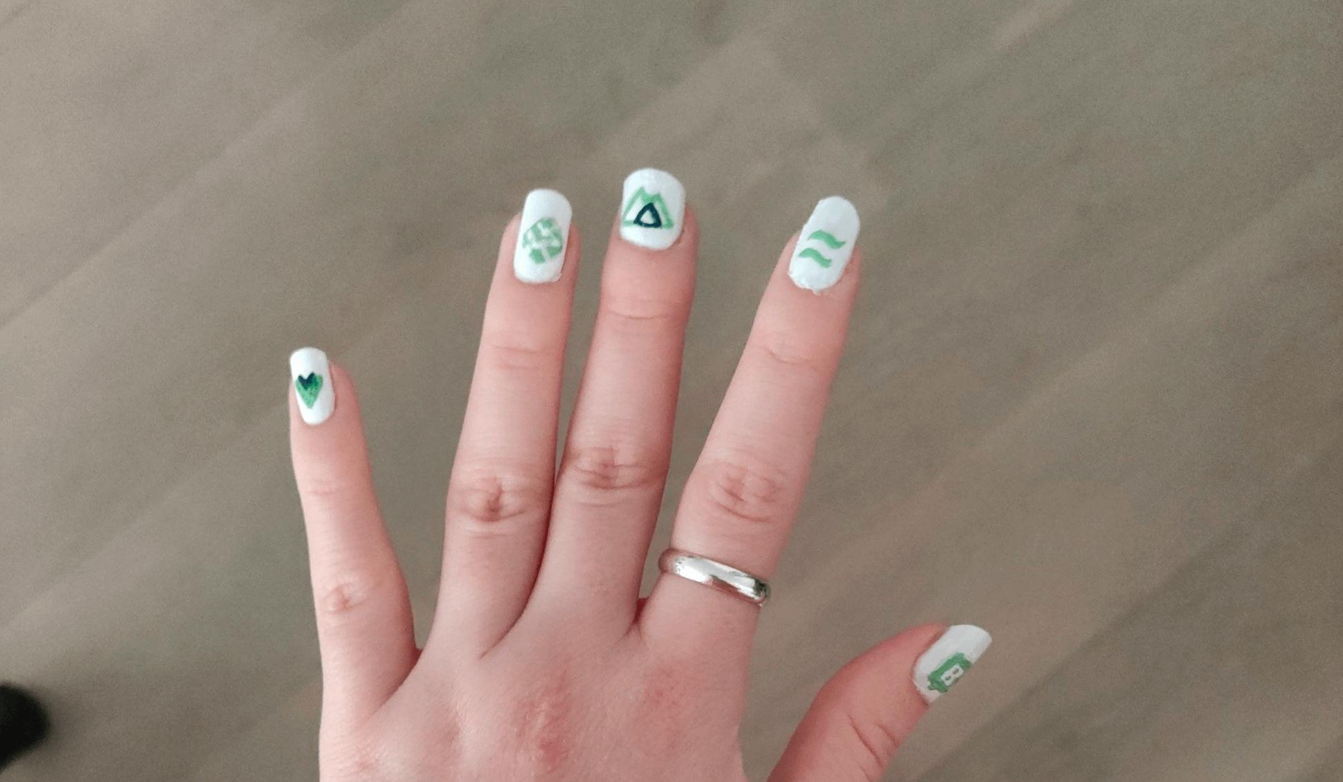
Now yes, I hope you found it useful or at least that entertained you for a while. Thanks for reading me and if you have any feedback you can reach me on any social network as @dawntraoz 💜
Happy Christmas to you all! 🎄

