In this post I want to show you how I created the style guide page with VUE & TailwindCSS, to present it in our dashboard in an interactive way.
Prerequisites
As this post is the continuation of Create a dashboard with TailwindCSS - Part 1, if you haven't read it yet you should take a look before starting.
Are you up to speed yet? Let's get on with it.
Create the style guide page
To start creating our style guide we need a new page, let's go to the pages folder of our NuxtJS project and add a file named styleguide.vue.
Once the page was created, I added a header with the main title and I sat down to think about the sections I would like to show on it. As all the sections will have a similar title and spacing, I've created a component named StyleSection.vue that will contain each one of them.
Therefore, the styleguide.vue template will have several references to the StyleSection component, each one with different content:
<template>
  <div>
    <header>
      <h1>Style guide</h1>
    </header>
    <style-section>
      <template slot="title">Colors</template>
      <colors />
    </style-section>
    <style-section>
      <template slot="title">
        <!-- Title: as Gradients, Font Style & Icons -->
      </template>
      <!-- Component: as Gradients, Fonts & Icons -->
    </style-section>
  </div>
</template>
In the script of our page we'll just import each component.
As they'll be only in the style guide page, I've created a folder in components folder named styleguide where I will store each one of them.
<script>
import StyleSection from '~/components/styleguide/StyleSection.vue'
import Colors from '~/components/styleguide/Colors.vue'
/* Import Components */

export default {
  components: {
    StyleSection,
    Colors,
    /* Components imported */
  }
}
</script>
Building components
Now let's take a look at the new components and its functionality.
StyleSection
As I mentioned before, in order to have a common style and to be able to represent each component in the same box, I created StyleSection.vue in the styleguide folder.
  <template>
    <div class="pt-8">
      <header class="pb-6">
        <h3 class="capitalize">
          <slot name="title"></slot>
        </h3>
        <p class="pb-2 border-b border-gray-300 text-gray-700">
          <slot name="title"></slot> for app theme.
        </p>
      </header>
      <slot />
    </div>
  </template>
Here, I simply add the spacing between sections and the base headers' styles. I've created two slots to be able to load that dynamic content. In the slot with name title we'll receive the title of the section that styleguide.vue passed us through:
<template slot="title">Colors</template>And in the unnamed slot we'll receive the rest of the content that is inside the style-section tag.
Now that we have the basis of each section, let's see what each one is about!
Colors
The first component that I come to show you will be the one that presents our color palette.
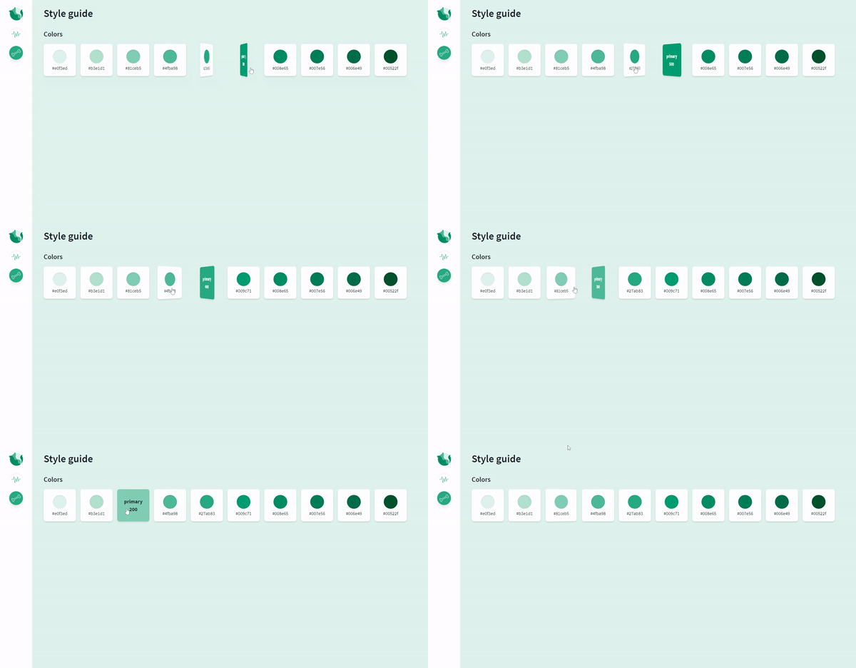
As in this post I wanted to talk about the possibility of adding new utilities in TailwindCSS, I have chosen a transition like flip card to add new properties that are not present in the default configuration of tailwind, let's see how to add them!
We're going to add a new utility by creating our own plugin, everything I'm going to explain is taken from the official documentation.
The first thing we need to do is get tailwindcss/plugin and save it in a variable on tailwind.config.js.
const plugin = require('tailwindcss/plugin')To use it, we'll need to add the code below in the plugins section of our configuration file. In this plugin, we're going to define the CSS properties we need for the flip card transition, which aren't in tailwind initial styles.
These properties are perspective, backface-visibility, transform-style with value preserve-3d and rotateY transforms.
  plugin(function({ addUtilities }) {
      const newUtilities = {
        '.rotate-y-0': {
          transform: 'rotateY(0deg)'
        },
        '.rotate-y-180': {
          transform: 'rotateY(180deg)'
        },
        '.transform-style-3d': {
          transformStyle: 'preserve-3d'
        },
        '.backface-hidden': {
          backfaceVisibility: 'hidden'
        },
        '.perspective': {
          perspective: '1000px'
        }
      }

      addUtilities(newUtilities, ['group-hover'])
   })
Note that when we add our new classes via addUtilities we pass in an array with the group-hover pseudo-class variant, this is so that these classes can be applied to the child when hovering over a specific parent element.
A pseudo-class variant allows you to style elements on hover, focus, and more. Check the multiple variants here.
Now that we have the classes created let's use them to make the transition!
I created a component called Colors.vue, in the styleguide folder. In it, I've defined a flexbox to contain the list of hues for each type of color.
  <template>
    <div>
      <div
        v-for="color in colors"
        :key="color.name"
        class="flex flex-wrap justify-center md:justify-start -mr-4"
      >
        <div v-for="item in color.palette" :key="item.color" class="pr-4 pb-4">
          <!-- Flip Card template -->
        </div>
      </div>
    </div>
  </template>
In this case we've two colors, primary and complementary, with ten hues each.
To represent them, I've created an array called colors with 2 objects, one for the primary color and its color palette and another for the complementary one. This is how the structure would be:
  colors: [
    {
      name: 'primary',
      palette: [
        {
          color: 'bg-primary-50',
          hex: '#e0f3ed',
          name: '50'
        },
        /* Other options */
      ]
    },
    {
      name: 'complementary',
      palette: [
        {
          color: 'bg-complementary-50',
          hex: '#fce5ea',
          name: '50'
        },
        /* Other options */
      ]
    }
  ]
Flip card element
Inside the flexbox container will be the color card with the flip transition which will look like:

To achieve this, we need to consider 3 things:
- The size of our card can't be dynamic, we have to define it static size on both the parent and the element faces. The parent will have a perspective to give a sense of depth in the rotation.
- The rotation will be executed by an intermediate element that, as we can see in the code below, has the group-hover variant. The parent element have to contain the group class for the group-hover to work.
The transition will be preserve-3d and must be executed in the intermediate element, such as the rotation.
The resulting template is:
<div class="group perspective w-28 h-28 cursor-pointer">
<div class="relative group-hover:rotate-y-180 transform-style-3d transition ease-linear duration-700">
  <div class="card__front">
    <!-- Front Card Content (Show by default) -->
  </div>
  <div :class="item.color" class="card__back">
    <!-- Back Card Content -->
  </div>
</div>
</div>
For the faces we must define a common style such as position, size and backface visibility a hidden, necessary to create the card effect. And a specific style of its rotation in the Y-axis, so that when the group-hover of the intermediate element is executed, the correct face is shown.
For this reason, we have to defined two classes card__front and card__back, in order to give them these styles.
<style scoped>
.card__front,
.card__back {
@apply backface-hidden absolute top-0 right-0 rounded-lg flex flex-col items-center justify-center shadow-md w-28 h-28;
}
.card__front {
@apply bg-white z-10 rotate-y-0 p-4;
}
.card__back {
@apply rotate-y-180 p-2;
}
</style>
Now, we could add as many colors and hues as we want!! ✨

Gradients
You might be thinking that the tutorial is going to be long, but don't worry, the component with more content was the previous one. Now the rest will be a walk!
For this component, I wanted to let you know about the TailwindCSS plugin package, which more than once has saved me from having to create the plugins myself.
To use it we just have to install it locally,
npm i tailwindcss-plugins -Dand add to our tailwind.config.js file plugins section, the plugin we want to use, in this case gradients:
  plugins: [
    require('tailwindcss-plugins/gradients')
  ]
To define the gradients we just go to the theme and add the gradients as you can see below. Then, we choose the gradient's name, to use it as bg-name-selected, and create an array to set the direction and the colors to use:
  theme: {
    ...,
    gradients: (theme) => ({
      'primary-45': [
        '45deg',
        theme('colors.primary.700'),
        theme('colors.primary.300')
      ],
      'complementary-45': [
        '45deg',
        theme('colors.complementary.700'),
        theme('colors.complementary.300')
      ],
      'mixed-45': [
        '45deg',
        theme('colors.complementary.300'),
        theme('colors.primary.100')
      ]
    })
  },
Now we can use it in our template as bg-primary-45, bg-complementary-45 and bg-mixed-45. By sending these variables as the gradient property of an object, we can dynamically represent the gradients we have as:
  <template>
    <div class="flex flex-wrap -mr-4 md:-mr-6">
      <div
        v-for="item in gradients" :key="item.name"
        class="w-full sm:w-1/2 md:w-56 pr-4 md:pr-6 pb-4"
      >
        <!-- Color composition -->
        <p
          :class="item.gradient /* item.gradient == 'bg-name-gradient' */"
        >{{ item.name }}</p>
      </div>
    </div>
  </template>
Fonts styles
The Fonts.vue component is not a mystery. As we have all the styles already defined in our base file, I have simply placed an example of each element that could appear on the dashboard.
This would be the resulting template and its view:
  <template>
    <div class="flex flex-wrap items-stretch justify-start">
      <header
        class="w-full lg:w-auto border-gray-400 pb-6 border-b lg:pb-0 lg:border-b-0 lg:pr-12 lg:border-r"
      >
        <h1>Heading h1</h1>
        <!-- Other Headings -->
      </header>
      <div
        class="w-full lg:max-w-xl border-gray-400 py-6 border-b lg:py-0 lg:border-b-0 lg:px-12 lg:border-r"
      >
        <p>
          Lorem ipsum
          <span class="italic">italic</span>
          <span class="text-primary-900">primary 900</span>
          <span class="underline">underline</span>
          ...
        </p>
        <p class="pt-4 font-bold">
          Font bold lorem ipsum.
        </p>
      </div>
      <p
        class="w-full lg:w-auto border-gray-400 pt-6 lg:pt-0 lg:pl-12 flex flex-col items-center justify-center"
      >
        <span class="text-giant leading-none">Aa</span>
        <span class="text-lg">Source Sans Pro</span>
      </p>
    </div>
  </template>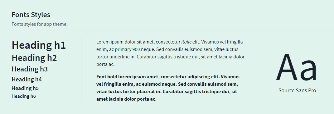
Icons
And finally, the last component! I've decided to show the icons we use currently on the dashboard.
I'll be expanding this component as I add new icons.
To avoid having to decide on a color and to be able to show the possibilities we have, I've decided to create a color selector. Simply, when you click on one of the colors the choosenColor variable will be updated and the icons having the fill-current property will apply that style.
Here I leave the component for you to have a look, as I'll have to add icons as we go along, I've created a class named icon-style to be able to reuse it.
As always with the styles of TailwindCSS using @apply.
  <template>
    <div :class="choosenColor">
      <ul class="w-full flex flex-wrap items-center pb-4">
        <li><p class="pr-4 pb-2 text-gray-700">Select color</p></li>
        <li v-for="color in colors" :key="color.bg" class="pr-2">
          <button
            :class="color.bg" class="w-6 h-6 rounded-full focus:outline-none"
            :aria-label="'Choose ' + color.text" @click="choosenColor = color.text"
          />
        </li>
      </ul>
      <div class="flex flex-wrap">
        <p class="pb-4 pr-4"><bone class="icon-style" /></p>
        <!-- Other Icons -->
      </div>
    </div>
  </template>

  <script>
  import Bone from '~/components/icons/Bone.vue'
  /* Other Icons */

  export default {
    components: {
      Bone,
      /* Other Icons imported */
    },
    data() {
      return {
        colors: [
          { text: 'text-primary-500', bg: 'bg-primary-500' },
          /* Other options */
        ],
        choosenColor: ''
      }
    }
  }
  </script>

  <style scoped>
  .icon-style {
    @apply bg-white rounded-lg shadow-md p-2 w-12 h-12 fill-current;
  }
  </style>
Good! I've finished telling you the progress on the dashboard, if you have any doubt or would like to guide the next post, don't hesitate to contact me 💜
This is our style guide page:
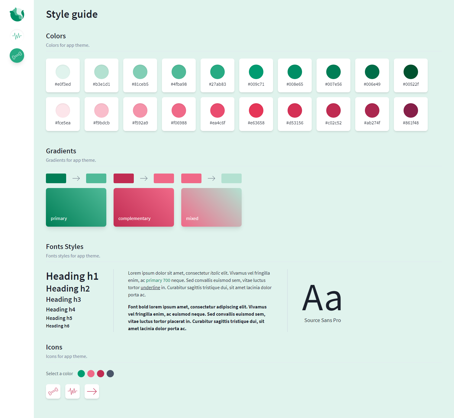
As I've uploaded the project to Heroku, you can now check the result in Cabbage Dashboard 💜
And remember, I will be adding new components and explaining the process, but you can ask me to do any feature you want to see in this series 🥰
I leave the repository here in case you want to take a look: https://github.com/Dawntraoz/cabbage

