In this post I will describe the process I follow to define the common style guide to a whole project using TailwindCSS.
How important is a design system
A Design System is a comprehensive guide for project design, realization and development composed by a collection of rules, principles, constraints and best practices.
Also known as the single source of truth that will allow the teams work aligned and keep/improve the quality of the product.
It is important to understand that a Design System is a full product itself and its main goal is to help the team of a project to build other products with the same basis.
If you want to know more about what is a design system or how to create one for your own projects, I recommend you Everything you need to know about Design Systems
The design
Now that we have a basic idea about what a design system is, we are going to carry it out with a practical case.
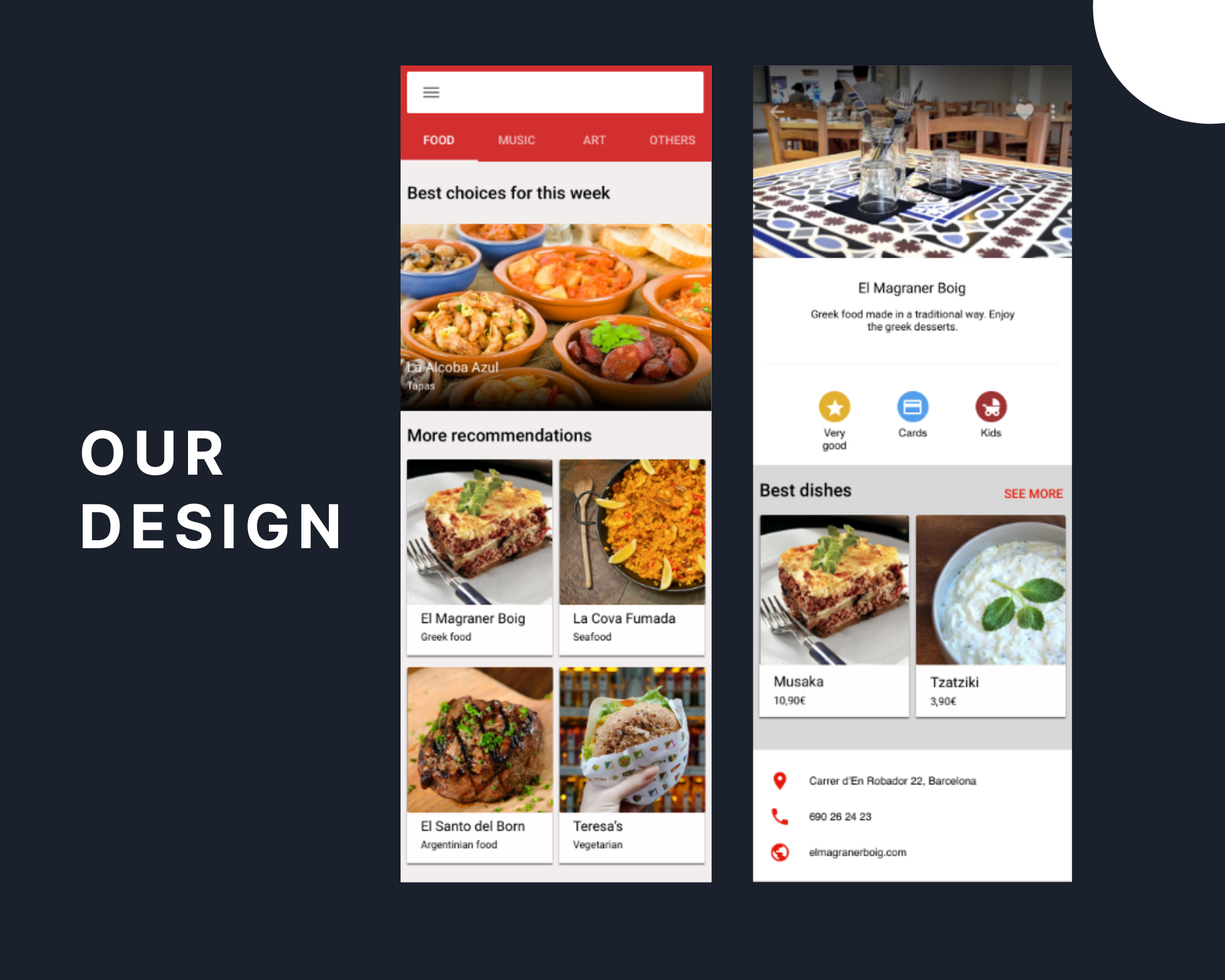
Given the design below:

Designed by my friend Rocío Pascual, Graphic Designer in process.
I'm going to define the steps that I usually follow when I start a project. Let's see them!
1. Choose a design system
You can use the one chosen by the designer or simply use the one that suits your team best.
In this post I'm going to define Color & Typography Systems using Material Design as my reference.
Material Design is a visual language that synthesizes the classic principles of good design with the innovation of technology and science.
Here, the important thing is not to use the best design system, but rather the one that makes the job easier for you and the other teams involved. Defining common guidelines will help streamline the development process.
2. Extract brand colors from the design
Once the design is finished, we can clearly see one or two colors that repeat, representing the brand colors of the product. The gray, white and black colors, unless the brand is based on them, generally do not represent it and are used for backgrounds, surfaces, borders, shades...
Search the primary color
In this design it can be seen that the color that is most repeated is red, therefore it would become our primary color. Having, at first glance, two variants: light and dark.
Search other brand colors
To have other colors that highlight the brand of the product, we can see the colors that represent the opinions, yellow, and the payment methods, blue. Thus having a secondary and tertiary color, with less importance than the primary one.
Define the rest
The rest of the colors that appear in the design but are not representing the product, I call them by their own name. In this case: gray and its variants, black and white.
After defining our color system, let's see how it would look!

3. Extract font family, size, weight & detail elements
Now that we have defined our color system, we are going to focus on the rest of the properties that we are going to need.
Every design has one or more font families, font sizes and weights. All we need in this section is to be clear about the name convention we want to use, to always remember what value we are referring to.
Font families
In my case, I usually name families by their own name, for example if we are going to use Roboto, 'sans-serif', my class would be called .font-roboto. But you could also call them by their functionality (.font-title, .font-text) or by their type like tailwind does (.font-sans).
Font weight
In the case of weights I use the name convention that is already defined by TailwindCSS, because it is very easy for me to remember it (Font Weight docs). The values are the same name you are referring as medium, bold, light.
Font size
To name the font sizes instead, I like to use comparative and superlative adjectives, such as bigger, smallest... But it is clear that we can also use the name convention that Tailwind offers us, with sizes that we recognize as sm, md... (Font Sizes docs) That is up to you and your team!
Other elements
A design can have many elements that we have not mentioned before.
In this example we have a border radius, a shadow and a gradient only, but we could have many more elements or even several of the same type, in which case we would have to stop to define which name convention will allow us to extend the project in the future.
Now we are ready to see the summary!

4. Extend TailwindCSS configuration
If you are viewing this post, I imagine that you already know about TailwindCSS, otherwise I recommend you to take a look at its website first.
Now, we only have to define our new variables in the TailwindCSS configuration file (tailwind.config.js) to start working on our project. For that, you can just override Tailwind's default variables or extend the theme to continue using its variables and combine them with yours.
As we are going to extend the theme, we will only need to add those variables that we have defined. Instead, the font weights and the black, white colors, for example, are already in the default theme, and we will only need to use them. You can see in their guide how to extend a color palette in detail to better understand the process.
Our extended section would look like:
module.exports = {
    theme: {
        extend: {
            colors: {
                primary: '#D32F2F',
                'primary-light': '#E51809',
                'primary-dark': '#9E3333',
                secondary: '#539FEC',
                terciary: '#E2B02F',
                gray: '#C7C4C4',
                'gray-light': 'F2EEEE',
                'gray-dark': '959494',
            },
            fontFamily: {
                roboto: ['Roboto', 'sans-serif'],
                helvetica: ['Helvetica', 'sans-serif'],
            },
            fontSize: {
                smaller: '12px',
                small: '14px',
                normal: '16px',
                big: '20px'
            },
            borderRadius: {
                normal: '2px'
            },
            boxShadow: {
                normal: '0 2px 2px #80000000'
            }
        }
    }
};
Once you have your configuration file ready and you have compiled the assets, you can start using the generated classes with your own naming convention.
Use cases
To be able to color a text with the primary color you only have to add the .text-primary class.
<p class="text-primary">My text</p>Instead, if you want to use it for a background, you should add .bg-primary, and with a border like .border-primary. This will happen with all generated color variables as:
  <div class="border-2 border-terciary">
    <p class="bg-secondary">My text</p>
  </div>
The same would happen with fonts and their sizes, using .text-normal our font size will be 16px and with .font-roboto we will change the font family to Roboto, 'sans-serif'.
Also, with border radius and box shadow, we just need to add .rounded-normal or .shadow-normal to use them.
There are many ways to start working on a project, but what I want with this post is to make you stop with me to think about how you want your project to be and what makes it more enjoyable to program.
I hope it has helped you, see you soon in other projects 🤗

