Positioning elements with Grid
In this post, I will show you the Grid basics and how I use it to place the content in common situations.
What is Grid?
Grid (CSS Grid Layout) is defined as a tool to divide a page into main regions or to define the relationship in terms of size, position and layer.
The Grid layout is compatible with the vast majority of browsers, some like Opera Mini and IE do not support it, in Can I use you can see what properties are supported by which browsers.
It is also known as the two-dimension layout system that provide us with the best alternative to the tables we used in the past, and has taken our user interfaces to the next level.
The grid layout allows us to align the elements in columns and rows, space the elements from the container element, position the child elements by overlapping them or forming layers, among other features.
This facilitates the creation of dynamic and responsive layouts, as we will see throughout the article.
Where to learn more?
Although in this article we will see the initial concepts and a couple of use cases, tips and tricks, I recommend that if you are interested in knowing the ins and outs of Grid, you should take a look at these resources.
In these courses and articles they explain Grid, show you different use cases and the little details they have learned from experience.
- Understanding CSS Grid Series by Rachel Andrew at Smashing Magazine.
- Learn CSS Grid course by Wes Bos (free).
- A Complete Guide to Grid by Chris House at CSS-Tricks.
Grid properties
Now that you know the Grid concept, we are going to see the properties we need to shape our layout, distinguishing between the properties of the parent or child element.
Being the parent element, the one that contains one or more child elements that will be sized, aligned, layered and redistributed by the available space. Let's see an example:
<div class="parent grid">
  <p class="child grid-item"></p>
  <p class="child grid-item"></p>
  <span class="child grid-item"></span>
</div>
The parent will be in charge of defining the grid and the children will be in charge of positioning or aligning themselves in specific places, if necessary.
Parent (grid container) properties:
display - specifies the type of rendering box of an element. With the value grid, every direct child will be in a grid context.
display: grid;grid-template - a shorthand property for defining grid columns, rows, and areas at once.
grid-template: none|grid-template-rows / grid-template-columns|grid-template-areas grid-template-rows / grid-template-columnsBut let's take a look at each property individually to see how to define them.
grid-template-rows - specifies the line names (optional) and track size of the grid rows (horizontal tracks).
grid-template-rows: none|[line-name] track-size [line-name-2];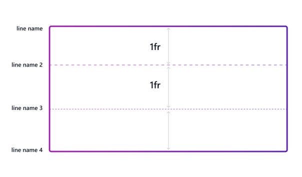
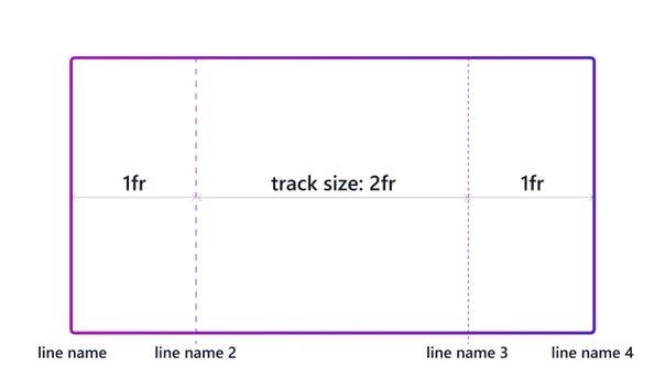
grid-template-columns - specifies the line names (optional) and track size of the grid columns (vertical tracks).
grid-template-columns: none|[line-name] track-size [line-name-2];A grid track is the space between any two lines on the grid. As we can see in the image below, between linename and linename2 we have defined a column track of 1fr in size.
To give value to the size of each row/column track, we must specify the values separating them by spaces and using different units:
By common units: length (px, rem, ...), percentage (%) and fr.
The fr unit represents a fraction of the available space in the grid container.
- By grid items content: min-content, minimum size of the content, max-content, maximum size of the content and auto, similar to minmax(min-content, max-content).
By functions:
- minmax(min-size, max-size) - It defines a size range, greater than or equal to min, and less than or equal to max.
- repeat(n-columns, track-size) - It allows defining numerous columns that exhibit a recurring pattern in a more compact form.
- fit-content(track-size) - It uses the space available, but not less than the min-content and not more than the max-content of the children.
/* Common units */
grid-template-columns: [linename] 1fr [linename2] 2fr [linename3] 1fr [linename4];
grid-template-rows: [linename] 1fr [linename2] 1fr [linename3] auto [linename4];

/* Grid items content */
grid-template-columns: 1fr max-content 2fr;
grid-template-rows: 1fr min-content max-content;

/* Functions (& combined) */
grid-template-columns: repeat(3, minmax(0, 1fr));
grid-template-rows: minmax(60px, 1fr) fit-content(75%);
grid-template-areas - specifies named grid areas by setting the grid cells and assigning names to them.
No grid item is associated to these areas, but any child element can reference any area with the grid placement properties (grid-row/grid-column, grid-area), which we will see below.
grid-template-areas: none|.|area-strings;The best way to understand this property is to exemplify it, and you will see it clearly.
  grid-template-columns: 300px repeat(3, 1fr);
  grid-template-rows: minmax(60px, 1fr) 4fr minmax(60px, 1fr);
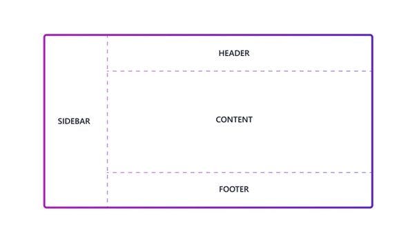
  grid-template-areas:  "sidebar header  header  header"
                                              "sidebar content content content"
                                              "sidebar footer  footer  footer";
The defined strings in grid-template-areas are the row tracks, and the times that a name is repeated is the columns that occupies that area in that row. As you can see in the image below, the header occupies 3 columns and 1 row:
grid-auto-columns - specifies the size of an implicitly created (auto-created) grid column track.
By definition, if we haven't explicitly defined in grid-template-columns the size of a column track where a grid item has been positioned, implicit grid tracks are created to contain it.
grid-auto-columns: implicit-tracks-size;The size unit can be any of the ones we have used for grid-template-columns and grid-template-rows.
  grid-template-columns: 300px;
  grid-auto-columns: 1fr;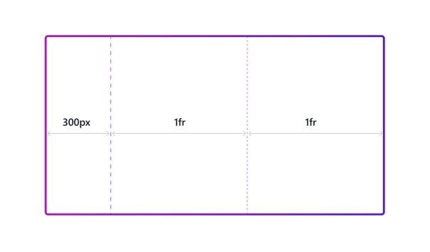
grid-auto-rows - specifies the size of an implicitly-created grid row track.
grid-auto-rows: implicit-tracks-size;As grid-auto-columns, we will use any size unit for the implicit row tracks:
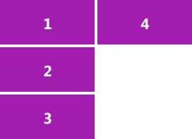
grid-auto-rows: 6rem;grid-auto-flow - controls how the auto-placement algorithm works, specifying exactly how auto-placed items get flowed into the grid (we can think of it as the flex-direction of grid).
grid-auto-flow: row|column|dense|[row|column] dense;While row and column, we can guess where the children of the grid will be placed:
row placing the items in the available horizontal track, if the current row becomes full then a new row will be started.

column in the available vertical track, once the items have filled all the rows in that particular column, then a new one will be created.
Instead, dense tries to fill in the gaps earlier in the grid. In the image below, you can see how the third element (blue) is placed in the space left between the first and second element.
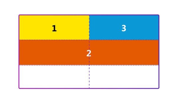
WARNING - grid-auto-flow: dense; can cause items to appear visually out of order, causing accessibility problems.
gap - sets the gaps (gutters) between rows and columns. It is a shorthand for row-gap and column-gap.
gap: row-col-gap|row-gap column-gap;(row-col-gap) As in padding, if we specify a single value it will be set for both row and column.
row-gap - sets the size of the gap in y-axis, between row tracks.
row-gap: 20px;column-gap - sets the size of the gap in x-axis, between column tracks.
column-gap: 5%;
Child (grid item) properties:
grid-row - specifies where a child is placed within the grid row tracks and how much it occupies.
It can be a line (placed in 1 row), a span (placed in more than 1 row), or auto (original placement), thereby specifying the inline-start and inline-end edge of the grid area it occupies.
grid-row: grid-line|grid-row-start / grid-row-end;Let's see what possibilities we have to define the start or end of the child item with the -start and -end properties.
grid-row-start - specifies a grid item’s start position within the grid row.
grid-row-start: [number|name]|span [number|name]|auto;line: number to refer to a numbered grid line, or name to refer to a named grid line.
span [number|name]: the child item will occupy the number of grid rows provided, or until it reaches the line with the specified name.
auto: automatic placement on the original position, with a span of 1.
grid-row-start: span 2; /* The item occupies 2 rows */grid-row-end: specifies a grid item’s end position within the grid row. The values that can be specified are the same as for grid-row-start.
grid-row-end: number|name|span [number|name]|auto;
Combining both would look like:
grid-row: span 2 / 5; /* Fit 2 rows and end in the numbered line 5 */
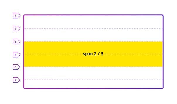
grid-column - specifies where a child is placed within the grid column tracks and how much it occupies. Same as grid-row but this time with the vertical tracks.
grid-column: grid-line|grid-column-start / grid-column-end;A shorthand for the CSS properties:
grid-column-start - specifies a grid item’s start position within the grid column by specifying a line, a span, or auto.
grid-column-start: [number|name]|span [number|name]|auto;grid-column-end - specifies a grid item’s end position within the grid column, also by specifying a line, a span, or auto.
grid-column-end: [number|name]|span [number|name]|auto;
grid-area - specifies where a child is placed within the grid and its size.
Its value can be expressed as a shorthand of grid-row-start / grid-row-end / grid-column-start / grid-column-end or with the name of the area created in grid-template-areas.
grid-area: named-area|grid-row-start / grid-row-end / grid-column-start / grid-column-end;Let's see a simple example for each case:
  /* Given grid-template-areas: "content content sidebar"; */
  grid-area: content;

  /* Specifying line numbers:
       grid-row-start: 1
       grid-column-start: 1
     grid-row-end: auto
     grid-column-end: 3
  */
  grid-area: 1 / 1 / auto / 3; /* OR grid-area: 1 / span 2; */
And these would be the properties that will help us to define the structure of our grid and position its elements individually. Now let's see how to align the elements in the same way, globally or from themselves.
Alignment properties
Whenever we want to align our layout elements, which are located in cells, we will have to use different properties from the parent but sometimes also from the children, depending on their behavior.
A grid cell is the smallest unit on a grid. Once a grid is defined as a parent, the child items will lay themselves out in one cell each of the defined grid.
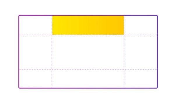
Let's see the possibilities we have to align our content by the container or child item.
Parent (grid container) properties:
place-items - allows you to align child items along the block (y-axis/column) and inline (x-axis/row) directions at once. A shorthand for align-items and justify-items.
place-items: align-items justify-items;To see the values that can be defined, let's take a look at each one of the properties:
align-items - specifies the alignment of grid items on the block direction (y-axis). It sets the align-self value on all child items as a group (we will see this property in the child properties section).
align-items: normal|center|start|end|stretch;
- center causes the elements to be aligned to the center of themselves (grid item cell).
- start & end causes the elements to be aligned at the beginning of themselves (cell top) or end (cell bottom).
- stretch causes the grid items to have the same height as their cell, filling the whole space vertically. The value by default (normal).
justify-items - specifies the alignment of grid items on the inline direction (x-axis). It sets the justify-self value on all child items as a group.
justify-items: normal|center|start|end|stretch;
- center causes the elements to be aligned to the center of themselves horizontally.
- start & end causes the elements to be aligned at the beginning or the end of themselves in the x-axis.
- stretch causes the grid items to have the same height as their cell, filling the whole space horizontally. The value by default (normal).
place-content - allows you to align the content along the block (y-axis/column) and inline (x-axis/row) directions at once. A shorthand for align-content and justify-content.
place-content: align-content justify-content;Let's take a closer look at the possible values:
align-content - specifies the distribution of space between and around content items in the block direction (y-axis).
align-content: normal|center|start|end|space-around|space-between|space-evenly|stretch;
- center causes the elements to be aligned at the center of the grid with respect to the y-axis.
- start & end causes the elements to be aligned at the beginning (top) or end (bottom) of the grid with respect to the y-axis.
- space-between causes the grid items to be distributed evenly, being the first item at the start of the grid, and the last at the end.
- space-around causes the grid items to be distributed evenly, having half-size space on top/bottom.
- space-evenly causes the grid items to be distributed evenly, having equal space around them.
- stretch causes the grid auto-sized items to have their size increased equally so that the combined size exactly fills the alignment container.
justify-content - specifies the distribution of space between and around content items in the inline direction (x-axis).
justify-content: normal|center|start|end|space-around|space-between|space-evenly|stretch;
- center causes the elements to be aligned at the center of the grid with respect to the x-axis.
- start & end causes the elements to be aligned at the beginning (left) or end (right) of the grid with respect to the x-axis.
- space-between causes the grid items to be distributed evenly, being the first item at the left of the grid, and the last at the right.
- space-around causes the grid items to be distributed evenly, having half-size space on left/right.
- space-evenly causes the grid items to be distributed evenly, having equal space around them.
- stretch causes the grid auto-sized items to have their size increased equally so that the combined size exactly fills the alignment container.
Child (grid item) properties:
place-self - allows you to align an individual child item along the block (y-axis/column) and inline (x-axis/row) directions at once. A shorthand for align-self and justify-self.
place-self: align-self justify-self;align-self - overrides the align-items value and aligns the item inside the grid area or cell along the block direction (y-axis).
align-self: center|start|end|stretch;
- center aligns the content to the center of the grid cell in the y-axis.
- start & end aligns the content to the start/end of the grid cell in the y-axis.
- stretch fills the grid cell in the y-axis (normal value).
justify-self - overrides the justify-items value and aligns the item inside the grid area or cell along the inline direction (x-axis).
justify-self: center|start|end|stretch;
- center aligns the content to the center of the grid cell in the x-axis.
- start & end aligns the content to the start/end of the grid cell in the x-axis.
- stretch fills the grid cell in the x-axis (normal value).
BONUS - Masonry Layout is an experimental feature, a layout method where 1 axis uses common values (usually columns), and the other the masonry value. In the axis of the masonry (usually the row), instead of leaving gaps after the small elements, the elements of the next row move up to fill the gaps. (AWESOME, isn't it?)
Real use cases
Now, I am going to show you how I usually solve, with CSS Grid layout, different situations that I found in website I've developed:
Situation 1 - Grid sidebar layout
Imagine you are developing a layout that includes a sidebar on the left, which follows you as you scroll, and the rest of the website, header, content and footer, on the right.
Here I show you an example of what I mean and how it could be distributed:
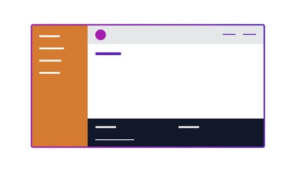
To do this, we will first define the grid container and the cells or areas we will need to place our elements, and then the position of the child items in the grid:
<div class="grid grid-cols-[300px,minmax(0,1fr)] grid-rows-[60px,1fr] min-h-screen">
  <aside id="sidebar" class="sticky top-0 h-screen">Sidebar</aside>
    <header class="row-span-1 col-start-2">Header</header>
    <section role="main" class="col-start-2">Content</section>
    <footer class="col-start-2">Footer</footer>
</div>
CSS Parent
  .grid {
    display: grid;
  }
  .grid-cols-[300px,minmax(0,1fr)] {
    /* 2 column tracks, 1st 300px, 2nd max the space available */
    grid-template-columns: 300px minmax(0, 1fr);
  }
  .grid-rows-[60px,1fr] {
    /* 2 row tracks, 1st 60px, 2nd the space available */
    grid-template-rows: 60px 1fr;
  }
  .min-h-screen {
    min-height: 100vh; /* Fill the full screen */
  }
Why is it important to define minmax(0, 1fr) instead of 1fr? Because by defining minmax and adding the possibility to have a smaller size than 1fr, the content does not overflow. This way, elements like a slider can be added to that responsive column without any problem.
CSS Children
  /**
  *    Aside - Sidebar
  */
  .sticky {
    position: sticky; /* Follow you when scrolling */
  }
  .top-0 {
    top: 0px;
  }
  .h-screen {
    height: 100vh; /* Fill the screen vertically */
  }

  /**
  * Header
  */
  .row-span-1 {
    grid-row: span 1 / span 1; /* Position: first row track */
  }
  .col-start-2 {
    grid-column-start: 2; /* Position: second column track */
  }

  /**
  * Content & Footer
  */
  .col-start-2 {
    grid-column-start: 2; /* Position: second column track (original position for the row) */
  }
Note: The examples will be styled with TailwindCSS using JIT mode, but I'm still going to add the generated CSS for those who don't use it.
Situation 2 - Grid post thumbnail layout
In this situation, our goal is to represent the thumbnail of our article, showing the image, the title, the description, the date and a like button to save it in our list of interests.
Let's imagine that the image below is the outline of how we want to represent it:

The first thing will be to define our elements in semantic HTML and start defining the grid in the parent, in this case the children will not need to specify their position because they will occupy the space that corresponds to them by location in the HTML.
<article class="grid grid-cols-[120px,minmax(0,1fr),64px] grid-rows-1 gap-4">

    <!-- Figure: By default will be added in the first column of 120px -->
  <figure>
      <img src="image_url" alt="image_alt" width="120" height="120" />
  </figure>

    <!-- Header (Title, excerpt and date): By default will be added in the second (available space) column -->
  <header class="py-4">
    <h2>Heading</h2>
        <p class="pb-8">Description or excerpt</p>
        <p>Date</p>
  </header>

    <!-- Like button: By default will be added in the last column of 64px -->
    <button class="w-8 h-8 p-4">
        <svg width="32" height="32">Like Icon</svg>
    </button>

</article>
As before, let's differentiate between the style applied to the parent and the one applied to the children:
CSS Parent
  .grid {
    display: grid;
  }
  .grid-cols-[120px,minmax(0,1fr),64px] {
      /* 3 column tracks, 1st fixed of 120px, 2nd responsive from 0 to 1fr, and 3rd fixed of 64px */
    grid-template-columns: 120px minmax(0, 1fr) 64px;
  }
  .grid-rows-1 {
      /* 1 row track responsive from 0 to 1fr */
      grid-template-rows: repeat(1, minmax(0, 1fr));
  }
  .gap-4 {
      gap: 1rem; /* gap between row and column tracks of 1rem (16px) */
  }
CSS Children
  /**
  * Header: Internal padding
  */
  .py-4 {
    padding-top: 1rem;
    padding-bottom: 1rem;
  }

  /**
  * Button: Size and internal padding
  */
  .w-8 {
    width: 2rem; /* (32px) */
  }
  .h-8 {
      height: 2rem; /* (32px) */
  }
  .p-4 {
      padding: 1rem;
  }
Situation 3 - Grid responsive layout
Another quite common situation that I usually find is the grid responsive by nature, that as the screen grows more elements are added to the previous rows, automatically defining the columns.
In this way, when the element of x pixels fits in the previous row it moves up and the next one moves to the position of this one.
If the width of the grid in the image below were larger, item 5 would be part of the first row.
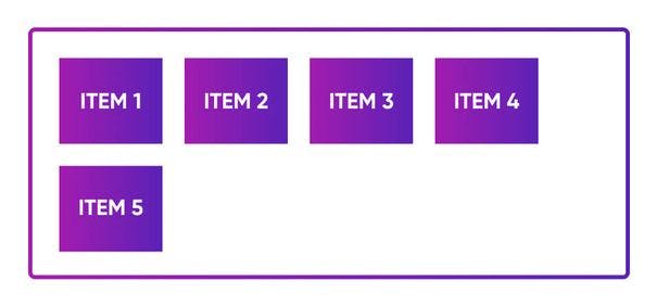
In this situation it is even easier to define the grid container, with just grid-template-columns we will be able to get that result, but in order to have space between the items we will add the gap property as well:
HTML
  <div class="grid grid-cols-[repeat(auto-fit, 150px)] gap-8">
    <article>Item 1</article>
    <article>Item 2</article>
    <article>Item 3</article>
    <article>Item 4</article>
    <article>Item 5</article>
  </div>
CSS
  .grid {
      display: grid;
  }
  .grid-cols-[repeat(auto-fit, 150px)] {
      grid-template-columns: repeat(auto-fit, 150px);
  }
  .gap-8 {
      gap: 2rem; /* (32px) */
  }
Basically, in this article I intended to have listed what I will need to review in the future when defining a new grid. And a couple of use cases to keep it fresh.
I hope you find it as useful as I did and have a wonderful week full of grids and layout!

